Showing posts with label Review. Show all posts

Wednesday, October 07, 2009

Software Review: Michael Andrew's PaintBaller Pro Presets

Written by T. Michael Testi

Michael Andrew PaintBaller Pro is a package of presets that give you the ability to create a unique feel to your images that can range from a painted look to High Dynamic Range (HDR) without any specific in camera manipulation. These presets work with Adobe Camera Raw and Adobe Lightroom 2.

Installing PaintBaller Pro is as easy as copying files into the appropriate directory as discussed in the instructions that are included with the product. There is one set of files for Lightroom 2 and one set for Adobe Camera Raw. The license allows you to use both sets, but if you only have one or the other, copy the appropriate files to their location and once you have done this everything is ready for you to use.

PaintBaller Pro comes with 25 different presets that give a wide variety of looks to your images. The fact that you can combine these presets, and that the specific order in which they are applied can change the look dramatically, there are virtually an unlimited number of combinations that can be created. Unlike actions, these presets are run from within the Adobe Camera RAW engine which comes with both Photoshop and Lightroom.

PaintBaller ProIn case you are not familiar with Adobe Camera Raw (ACR), this is a plug-in originally designed for Adobe Photoshop that is used for working with the RAW files that DSLR cameras produce. Camera Raw makes the process easier by giving you complete control over these uncompressed negatives, and allowing you to control many parameters within the image.

Adobe also integrated the ACR functionality into Lightroom when it was released the functionality of the two are the same. The differences come from the application. One of the main differences though is that in Lightroom 2 is that you can preview your preset change before you apply it. In Camera Raw you have to apply it to see the change.

Michael Andrew created these presets because as a photographer, he knows how easy it is to get into a creative rut. This can lead to images that become monotonous and repetitive. By creating PaintBaller Pro, he is providing new techniques to help you get your creative juices flowing again.

PaintBaller ProYou do need to be comfortable with working with ACR or Adobe Lightroom 2 in the develop mode because chances are that applying a preset by itself will not provide perfect results. Many times, depending on the image, they will not look very good. Your success will come from "tweaking" the photo to get them to turn out correctly. When you purchase the product, you will receive a link and a password to access some video's that will show you the major and minor tweaks you will work with.

Once you have PaintBaller Pro installed, then it is really easy to apply a preset. First you select which medium you will work in - ACR or Lightroom. For ACR, you open Adobe Bridge and select the photo that you want to use and open in using ACR. Then in ACR you select the preset tab and select a preset and apply.

In Adobe Lightroom 2, you select the preset tab on the left panel and navigate to the MA PaintBaller Pro LR2. Then when you hover over a specific preset you will see the change in the preview window. From personal preference, to me it is easier working from within Lightroom but they work equally as well from either.

While, if you don't have a camera that shoots Camera Raw, you can still take advantage of PaintBaller Pro as it does work with any files that work within ACR which includes JPEG files. One thing to keep in mind is that because a JPEG file is compressed, it has lost data and therefore the quality may not be as good as if you used a raw file.

There are also other things that can affect result quality such as ISO settings and the amount of noise in the image. If you want to see some samples of what PaintBaller Pro can do for you check out the PaintBaller Pro Samples Page. There are also video demos there as well.

PaintBaller ProI found the Michael Andrew PaintBaller Pro presets very easy to use and very intuitive as having a lot of flexibility. This set is $150 and can be purchased at Michael Andrew's store. If you are looking for something to put some pop into photos, then check out PaintBaller pro.


The list of PaintBaller Pro presets that are available are:

• "A1 Starter"
• "Blitz"
• "Blown Away"
• "Comic Boy"
• "Comic Girl"
• "Dead Eye"
• "Edge"
• "Fullback"
• "Grenade"
• "Hat Trick"
• "Ice"
• "Jello"
• "Katana"
• "Lorie"
• "Maverick"
• "Newspaper"
• "Oreo"
• "Pseudo-Sun"
• "Quick Mint"
• "Rootbeer Float"
• "Secret Sauce"
• "Time Warp"
• "Viper"
• "X-Ray"
• "Zing"

Adobe Photoshop CS4 for Photographers: A Professional Image Editor's Guide to the Creative use of Photoshop for the Macintosh and PC

The Adobe Photoshop CS4 Book for Digital Photographers
Adobe Photoshop CS4 One-on-One

Thursday, October 01, 2009

Michael Freeman's Perfect Exposure: The Professional's Guide to Capturing Perfect Digital Photographs

image

Description

Clear, direct and guaranteed, the perfect exposure method looks at the way professionals work, and lays out the decisions and sequences with absolute clarity, while incorporating the latest, powerful post-processing techniques. Choosing the exposure for a photograph is infinitely complex and one of photography's most absorbing paradoxes because it affects everything in the image and its effect on the viewer. Understanding how and why exposure works is essential, not only because it helps you to decide what is instinctively "right," but this book will give you confidence in that decision--an invaluable skill for every single photographer. Full of beautiful photographs taken by Michael Freeman, this book will arm you with the tools you need for perfect exposure of your photographs.
* Written by world-renowned expert photographer and author Michael Freeman
* Ground-breaking exposure system for digital age photography
* Uses clear examples from real photo assignments with in-depth explanations
* Foolproof flow charts enable quick and easy comprehension

Contents

1. Fast-Track and Foolproof; 2. Technical Basics; 3. The Twelve; 4. Style; 5. Post-Processing; Glossary; Index

Read the full Review….


Michael Freeman's Perfect Exposure: The Professional's Guide to Capturing Perfect Digital Photographs

Tuesday, September 29, 2009

Visual Poetry: A Creative Guide for Making Engaging Digital Photographs


image

A great photograph has the potential to transcend verbal and written language. But how do you create these photographs? It’s not the how that’s important, but the who and the what. Who you are as a person has a direct impact on what you capture as a photographer.
Whether you are an amateur or professional, architect or acupuncturist, physician or photographer, this guide provides inspiration, simple techniques, and assignments to boost your creative process and improve your digital images using natural light without additional gear.
Chris Orwig’s insights—to reduce and simplify, participate rather than critique, and capture a story—have made him an immensely popular workshop speaker and faculty member at the prestigious Brooks Institute. His engaging stories presented as lessons follow his classroom approach and highlight what students say is his contagious passion for life.

Read More…

You can read my review on Blogcritics.org or take in some Sample Chapters.

Chapter 2: Creativity and Photography

Chapter 4 – Camera Creativity and Technique

Technorati Tags: ,,

Friday, July 17, 2009

Product Review: Intuos4 From Wacom

Written by T. Michael Testi


If you use a product like Adobe Photoshop, or Corel Painter, and you are not using a pen tablet, then you don't really understand what you are missing. A pen tablet allows you much more control than you can get with a mouse. It gives you much more efficiency in movement and the pressure sensitivity gives you the same kind of control that you would get from a pen, pencil, or paint brush.

The Intuos4 consists of a digitized pad that plugs in to the USB port on your computer. Your computer then treats the device as though it were a mouse. Through the use of a product like Photoshop or Painter that can take advantage of the rich technology that the pad enables, such that when you use the pen, you can apply more or less pressure which translates to various thicknesses and more or less affect on your image.

Intous4There was a time when the pen tablet was geared just for the commercial artist. They were expensive and the limited amount of software that was enabled to use the device was also geared toward the professional. Then came the Intuous3 which, while having a reasonable pricing structure, also seemed to work with more products, and now had traditional artists as well as photographers getting in on this technology.

Now enter the Intuos4 line of pen tablets. Not only has the price remained reasonable, there are now four sizes to choose from, and the quality of the product has improved dramatically. The total shape and surface have been completely re-engineered to give you more consistent strokes over longer periods of time.

I have worked with the Intuos3 (the 6 x 8 inch) for a number of years and it has become a mainstay in my workflow. Early on, that workflow was primarily photography where it has helped me with things like dodge, burn, sharpen, and blur effects as well as other techniques enormously. Over the course of the last couple of years, I have added Painter to my arsenal and would be hard pressed not having a Wacom tablet. The control is just phenomenal.

In the new Intuos4 line the tablet sizes are small (3.9 x 6.2), medium (5.5 x 8.8), large (8 x 12.8), and extra large (12 x 18.2). The one I now have is the medium and it is roughly the same size as my Intuos3. It is a tad bit smaller on the overall area, but as I realized with the longer width and smaller height is that it works better with my widescreen monitor.

Intous4What do you need to run the Wacom Intuos4?

• Windows XP (SP2), Windows Vista, or Mac OS X10.4.8+
• Color Display
• Powered USB Port
• CD/DVD Drive
• Internet connection to download the bundled software that comes with the tablet

What do you get with the Wacom Intuos4?
• The Intuos4 tablet
• The Intuos4 Grip Pen
• The Intuos4 Mouse
• Pen stand
• Ten replacement nibs (five standard, one flex, one stroke, and three hard felt nibs)
• Nib extractor
• 5' USB cable
• Quick Start Guide
• Installation CD (includes tablet driver software and electronic user manual)

OK. This stuff is all cool, but what about the tablet? Well let's start off at the beginning. While it does not bring anything to the table from a quality of the tablet standpoint, it does show me that they are taking everything into consideration, and that is the very well designed packaging. From first look, you just know that there is something special in the box.

Opening the box you have the re-stylized tablet itself. Its black appearance is much sleeker than the previous grey look. The eight programming ExpressKeys are grouped on one side and they are highlighted with illuminated labels that light up in blue and really make it stylish. The pen holder is a little taller, and the pen itself is much sleeker.

Installing the software is a snap. Pop in the disk and follow instructions. You do want to wait till prompted before you plug the tablet in. One of the new things about this tablet is the fact that, unlike the Intuos3, the keys are set on one side and in the middle. There are two USB ports on the unit and you can switch which one based on if you are right-handed or left-handed. Again, well thought out.

So what is new with the Wacom Intuos4?

Intous4New tip sensor now gives you ultra control. The Intuos4 now gives you the ability to capture the slightest nuances of pen pressure right down to a single gram of weight.

Twice as much pressure as the Intuos3. The Intuos4 now gives you 2048 levels of pressure sensitivity. This will let you dynamically adjust the exposure, brush size, line weight, and opacity.

More natural feel has been given to the Intuos4 pen style. It features a more contoured barrel which is designed to maximize your grip. It will even reduce the stress to your hand and wrist as well as better emulating your favorite writing, drawing, or painting instrument.

More efficient shortcuts have been implemented by the use of the ExpressKeys. These will give you the ability to activate your own unique shortcuts and modifiers in each of your applications. You can even see your settings change in the illuminated display areas when you switch between applications.

New Touch Ring will give you better control for zooming, scrolling, changing brush size, rotating the canvas, or layer selection. The toggle button in the center allows you to control up to four different functions in each application.

User-defined switches that are located on the pen are preset to right-click and double-click, but you can change them to be what you want based on your most commonly used functions.

Slimmer profile is more comfortable than the Intuos3. It has a more gently sloping feel and an "easy glide" palm rest that provides for more support while working on all areas of the tablet.

Pen tip storage is now in the pen stand. Remember when I said that the pen holder is taller? It is taller so that you can store pen nibs in it. Just twist it off and you will see the ten replacement nibs. In the center is also a small ring that you pull out and it can be used for extracting nibs that wear out from excessive pressure.

Intous4Visual references are available on the Intuos4 medium, large, and extra large tablets. The illuminated displays provide a visual reference to each key's function. On the small tablet, pressing the default ExpressKey will display the setting to the screen.

Additional Software is available when you register. You get Nik Color Efex Pro 3 Wacom Edition 6 which are a set of photographic filters for the use in digital photography and transforming your images. You get Wacom Brushes 3.0 which are additional brushes for your use in Photoshop and Photoshop Elements. And you get to pick two out of these three products: Photoshop Elements 7 for Windows or Photoshop Elements 6 for Mac, Autodesk SketchBook Express 2010, or Corel Painter Sketch Pad.

Reversible table makes much more sense than two sets of buttons on each side. Now you can maximize your productivity of both of your hands by having everything on the side that you would use it most on.

The mouse is not really new, but not something that I use much. Along with the pen, there is also a mouse that comes with the Intuos4. Like the pen and tablet, the mouse too is black. For those who use the tablet 24/7, the mouse is there to replace your mouse so you can keep your tablet on your desk the whole time.

The more I work with the Wacom Intuos4, the more I appreciate the 16:9 aspect ratio. I am not sure how this will affect someone with monitor that has a 4:3 aspect ratio, but I think that this can be rectified by limiting the area within the configuration setup.

While it will take some time to really get use to, I do like the ExpressKeys. The reason I say this is that with the Intuos3, the keys were different shapes and different directions. Here they are all the same size and right next to each other and it is easy to think that you are hitting one when you are hitting the one next to it. Not a big deal, just a bit of retraining.

Another great innovation is the Touch Ring. With the old tablet, you had the Touch Strip, but you could only assign it one function. Now the new Touch Ring can support four functions. And switching is all with the press of the central button. The Ring functions much like the ring on an iPod.

The Pen, which is black like the tablet, is also much improved. I liked the old pen really well, but the new one is just so much better. The grip is rubberized and it is so much more comfortable than before. It really feels like you are holding a natural pen. The enhanced sensitivity really gives you the feel of control. The pen stand is also outstanding in its design and use ability.

Intous4The tablet itself is a big improvement. The surface has a better feel to it. It is almost like you are drawing on paper or canvas. The ergonomic design is more comfortable than drawing on a paper tablet, but without losing feel.

My only real complaints beyond the closely spaced ExpressKeys are that the black styling is a finger print magnet and a dust collector. It is to a lesser degree the same with the pen.

That said, if you are considering a graphics pen tablet, and are still on the fence, then let me give you a little push. For the price, the Wacom Intuos4 Medium is really a good deal. One thing to keep in mind that from the stand point of size, the medium is probably the largest that most people will need. It takes up a good bit of desk space, but is balanced with the size of the new monitors.

I had my last one for over four years and it has served me well. Once you get accustomed to using the pen tool, you will wonder how you could have survived without it. It is for that reason that I very highly recommend the Wacom Intuos4 Medium Tablet.

Technorati Tags: ,,,

Monday, June 29, 2009

Book Review: The Hot Shoe Diaries: Big Light from Small Flashes by Joe McNally

Written by T. Michael Testi

Joe McNally is an internationally acclaimed photographer whose 30-year career has included assignments in over 50 countries. His images have graced the covers of Time, Sports Illustrated, National Geographic, and during the 1990s he was Life Magazine's sole staff photographer.

So just what is The Hot Shoe Diaries? It is a book about what Joe McNally has learned about lighting and the lighting of a wide range of situations during his photographic career, and it includes a wide variety of images he has created during that time. He begins with the basic gear and then works with one light, then two or three and then quickly accelerated to Mach1 which, to paraphrase Led Zepplin, is about a "Whole Lotta Light." The Hot Shoe Diaries is 320 pages and divided into four parts.

Part I, "Nuts 'n' Bolts," introduces us to what kind of equipment the author uses, how he shoots, how he meters, and all about the different settings that he frequently uses. He explains about the flashes, and the technology of today's flashes. He also goes into detail about the other gear that accompanies him on a shoot.

Keep in mind that McNally is a Nikon shooter so when he talks camera and especially the flash technology he comes from a Nikon angle. This should not dissuade users of other models as the book is about concepts and techniques and not technology.

He then goes in to his philosophy of light, shooting, and explains how one should go about learning to hone their abilities. Finally, he goes over how best to grip the camera and take your steadiest shot.

Part II, "One Light!" is, as the title implies, about using one small flash to light your scene. In these articles, there are quite a variety of lighting situations from an open room where the flash is used as fill light, to a night scene where he uses it to capture the eye and the silhouette of an alligator.

He explains about good light and bad light and how the flash can be used in a non-optimal scene, how it can be used in conjunction with light from a doorway, and even how to use the flash to make it appear that the sun is rising on a cloudy day.

Part III, "Two or More," now gets into shooting with multiple lights. The problem with shooting with a single light is that in situations where there is no other fill lights such as from an open window, the one light can leave shadows and harsh areas. This is especially true if that one light is the pop-up flash on your camera. According to the author, the pop-up flash should only be used in a pinch when you don’t care about the image, or for taking a picture of someone you don't like.

On the other hand, the pop-up can be used as a driver for a handheld or remote wireless flash. In these situations then you will have better luck. In this section you will explore how McNally uses a couple of flashes to light a situation.

"Lotsa Lights," the topic of Part IV, are what you need when lighting full scenes or large objects. In this section you will see what is needed to light more complex situations. Imagine you want to photograph a person in a garage scene. Well two or three lights will be fine for the person, but what about the background? You may need some for around the bench, some for the walls, etc.

The examples in this chapter includes low light scenes that need many lights to convey a mood, to outdoor projects that need to move quickly because of the heat and sun, to how to build a backyard studio, to lighting an Air Force plane using 47 Speedlights.

So in this part you will see how to get a scene to give up its nooks and crannies. To do that you have to plan what you are going to frame in your shoot so you can see what you need to light. You will also explore other areas to do complex lighting

As with the author's first book, The Hot Shoe Diaries is a fun and entertaining read. But most of all it is classic Joe McNally. For those who follow his blog you will know what I mean, for those who don't you should check it out.

For the most part The Hot Shoe Diaries is written in an easy to understand, conversational style, but there are times when someone new to photography, or someone who may have experience with a camera, but not with photographers, might miss some things in translation.

McNally speaks in photographer jargon at times. For example in one place he says "Zoomed the flash to the maximum at 105mm, gelled it with two cuts of CTO to keep it warm in tone, and dialed the power output way down." If you don't know that CTO stands for Color Temperature Orange, and that the gel is used on your flash correct the lighting, you may be intimidated by the language.

What I say is that if you want to become a better photographer, become better with using flash in lighting situations, then when you don't understand something, find out. It is easy to do. Some may say that this book is not for newbie's. I disagree; I think that The Hot Shoe Diaries is for anyone who wants to learn to use small flashes to create big light. I very highly recommend this book.


Friday, May 29, 2009

Book Review: Photoshop CS4: Down And Dirty Tricks By Scott Kelby

Written by T. Michael Testi

It has been a while since author Scott Kelby has put together a Down And Dirty Tricks volume together, but now, with Photoshop CS4: Down And Dirty Tricks he has come back to where it all started and he has accumulated a whole host of new Photoshop special effects in one book.

This title has been one of the best selling Photoshop books in history and its release is long overdue. Down and Dirty 5.5 was the first book that Scott Kelby ever wrote and subsequently, is what started his career.

Keep in mind that unlike many of Kelby's recent books, THIS IS NOT A BOOK ABOUT PHOTOGRAPHY. You will not learn about camera raw, about sharpening, about curves, or levels, or channels. It is a book about creative design with photographs. It falls back to an earlier time in his career when he worked with design effects.

The effects that are contained within are the same types of effects that you see on TV, in magazines, and on the Web. The book also contains creative ideas, layouts, and design techniques to enhance your creativity. Photoshop CS4: Down And Dirty Tricks is 384 pages long and is divided into nine chapters.

Chapter 1, "Miracle Photo," is the first of two chapters on photo effects. Some of the techniques include a very popular de-saturated portrait look, a corporate ad that takes on a sports poster look, a reflected sky logo technique, and an effect that takes a photo of a real object (a baseball stadium) and makes it look like a toy.

Chapter 2, "Studio 54," looks at professional style studio effects that are done in Photoshop. These include a logo that is placed on a grid-like floor that goes off in the distance, adding texture and aging to a photograph, and a gritty high contrast portrait look,

Chapter 3, "Commercial Break," works with special effects that are used in commercial environments such as brochures and advertisements. These include a sports-look bio page, a line burst background effect, and a back screen layout.

Chapter 4, "Dangerous Type," examines type effects that have been made famous from various sources beginning with the halftone pattern type look that was used for Ford's F-150 trucks. Then you will see how to create the look used in the movie "Fracture," the Play station type effect, and others.

Chapter 5, "Reflections of Passion," now explores reflection effects. You begin with how to correctly create a basic reflection. While this may seem simplistic, it is something that I have seen messed up by many. You then move on to letter or shape reflections using a double gradient, a glassy bar reflection, how to create a 3D video wall with live updating reflections, and more.

Chapter 6, "Truth in Advertising," is about effects seen in web and magazine ads. Included is a multi-photo look to use when you have only one photo, but don't want that one photo look. A fake see-through glass look, and a chrome with photo reflection look that Disney Pictures used on their new logo.

Chapter 7, "The Midnight Special," contains more special effects that include working with a mix of photos and vector art, a fashion-warped grid look, and a fading people in the background look.

Chapter 8, "Photo Finish," is a second chapter on photo effects. Here you will see such effects as creating a sports wallpaper look, how to add window light to flat looking photos, and creating sparkle trails.

Chapter 9, "3D Jamboree" was actually written by Corey Baker, an instructor and 3D specialist at NAPP - since Scott Kelby admits that he lives in a 2D world. In this chapter you will learn how to create true 3D lights and shadow, 3D package design, a 3D filmstrip, as well as a 3D sports logo.

As with all of Scott Kelby's books Photoshop CS4 is very well written, easy to understand, and chocked full of pictures and descriptions. And, as with all of Scott Kelby's' books, there is a certain amount of humor that you either tend to like or hate. For those who are not a fan, he does contain this humor to the first page of each chapter where you can get by without reading it. For me, it just wouldn't be a Kelby book without it.

While Photoshop CS4 is about learning how to create and use special effects, according to the author, it is more about doing things other than photography, sharpening, camera raw, and all the other usual techniques you find in most Photoshop books. It is about learning the "other side" of Photoshop.

One thing to keep in mind is that Down And Dirty Tricks should be viewed as a cookbook and not an in-depth guide to each of these techniques. I have heard in the past where someone says that the book just tells you to put in values, but not why to pick those values? For example, in this book in one tutorial you are told "when the Gaussian Blur dialog appears, enter 9 pixels, then click OK to apply…" Sure, you are not told why 9 is the magic number, but this is no different than when you are making spaghetti sauce and you are told to put in an 8 oz can of tomato paste. If you want to try 6 go for it.

For me, the real purpose of Photoshop CS4: Down And Dirty Tricks is not to show you how to recreate the effects demonstrated here, although if you needed to, you have the steps. The real purpose is to show you the steps to recreate an effect. Then with an arsenal of techniques at hand, you can start putting your own techniques together to create your own style. In his intro, the author recommends that you work through each tutorial even though you may never use that technique. It is because of value of gaining this arsenal that I very highly recommend this book.


Tuesday, March 10, 2009

Book Review: Real World Adobe Photoshop CS4 by Conrad Chavez And David Blatner

Written by T. Michael Testi


Real World Adobe Photoshop CS4 is subtitled "Industrial Strength Production Techniques" because that is really what the focus of this book is - how to move images through Photoshop. But this book is not just about Photoshop, it is also about photography and images and translating your own understanding of images into the digital world of Photoshop.

Real World Adobe Photoshop CS4 knows that when you are in a crunch, you have to have an instinctive, intuitive feel for what is going on in Photoshop to finesse it to your needs. Because of this there is a lot of conceptual discussion that goes on in this book. The goal then becomes how to take what you already know and incorporate it with new tools that will give you the ability to push Photoshop to the limit.

This new edition has been completely gone through, tightened up and updated to take on the new features of Adobe Photoshop CS4 including the Masks panel, Modeless Color Correction, Adobe Camera Raw 5, and much, much more. Real World Adobe Photoshop CS4 is contained in 448 pages divided into 12 chapters.

Chapter 1, "Building a Photoshop System," will show you what you need to build a quality Photoshop system. Mac or PC is not as important as having enough power to do the kind of work you need done. Chapter 2, "Image Essentials," reminds us that computers do not understand about images, tone, color, or any of those other things that we view as important about images. While you won't have to understand binary math to work with Photoshop, it does help to understand how Photoshop thinks.

Chapter 3, "Color Essentials," examines the different ways that different people thing about what makes a color. Regardless of if it is RGB, CMYK, Lab, or some other variation, this chapter looks at the fundamental color relationships and how Photoshop presents them. Chapter 4, "Color Settings," constitutes the heart of this book. While the authors consider every topic to be important, they feel that unless you understand how Photoshop handles color behind the scenes, you will never achieve the quality of image that you should be able to get.

Chapter 5, "Building a Digital Workflow," explores what it takes to build a true digital workflow that allows you to make quick work of your digital images. Because taking digital images is so cheap, you soon find you have so many more images which mean that there are many more images to handle. This chapter is all about getting through Adobe Camera Raw as quickly as possible. Chapter 6, "Essential Photoshop Tips and Tricks," continues the work in chapter 5 in that the biggest boost to your productivity is to accelerate it with the tips and trick found here. As a sideline, included here are a couple of Easter eggs included in Photoshop including one honoring the late Bruce Frasier, one of the authors of this book.

Chapter 7, "Image Adjustment Fundamentals," is about tonal manipulation, the adjusting of the lightness or darkness of your images. This is what makes the difference between a flat image and one that pops out and draws you into it. Chapter 8, "The Digital Darkroom," will show you how to get the most out of adjustment layers to make your adjustments instead of burning pixels. By using these techniques, you will be allowed to experiment more with little or no degradation and maximum flexibility.

Chapter 9, "Making Selections," is as important when silhouetting and compositing images as it is when making nondestructive tonal corrections, color corrections, sharpening, and retouching. But to do this you also have to become comfortable working with masks and channels. Chapter 10, "Sharpness, Detail, and Noise Reduction," points out that for us to have a lifelike image it must have sharp edge definition. No matter what quality there is to your scanner or digital camera, you will loose some definition and hence loose sharpness. Here are some techniques to bring that sharpness back.

Chapter 11, "Essential Image Techniques," is a chapter that gives a lot of techniques that allow your images to soar. This is basically a potpourri of tips and tricks that will not only make your images better, but speed up processing as well. Chapter 12, "Image Storage and Output," provides methods of output for those professional images that you are now creating for both printed as well as online destinations.

Real World Adobe Photoshop CS3 is well thought out and well executed. It is definitely a must-own for anyone who wants to get to the nuts and bolts of working with Photoshop. There are hundreds of tips that can be found in the densely filled pages. So much so, that I don't think that there is anything else that comes close to providing this much detail in a book on Photoshop.

Real World Adobe Photoshop CS4 is not going to be for everyone, but if you have a reasonable knowledge of how Photoshop works and you want to learn how to be more productive, have a better understanding of why it does what it does so that you can control the results that you get, then this is an essential book and I highly recommend it.


Technorati Tags: ,,

Tuesday, February 17, 2009

Book Review: The Photoshop Lightroom Workbook - Workflow Not Workslow in Lightroom 2 by Seth Resnick And Jamie Spritzer

As co-founders of the photography training and consultancy company D-65, the authors Seth Resnick and Jamie Spritzer understand the importance in the use of Adobe Lightroom 2, and especially in how to manage its workflow. In The Photoshop Lightroom Workbook, they will attempt to present a well tested workflow that photographers can implement exactly as they do at D-65.

What's more is that in The Photoshop Lightroom Workbook the workflow can be adapted to a specific photographers job requirements, or changed on a job by job basis. As being alpha testers of the product, they have worked with the product for a long time and through insider knowledge, tips, and tricks they plan to take you from before you shoot to out to output in an effective and efficient manner.

Chapter one, "Before You Shoot," begins by examining the importance some of the key elements that you need to consider before shooting digital. In this section you will look at memory cards, ISO, white balance, using a color checker, working with histograms, filters, and other important concepts in the digital world.

Chapter two, "Understanding File Formats," looks in to the various file formats that can be used while shooting digital and what some of the pros and cons of each are. Chapter three, "Color Space for Digital" digs down into the four main color spaces that you can work with when dealing with digital; sRGB, Adobe98, ColorMatch, and ProPhoto. Here you will examine why you would or would not want to use each one of them.

Chapter four, "The Lightroom Catalog," now explains the catalog system. One of the main reasons you would want to use Lightroom is for its powerful cataloging and file management system. Chapter five, "Lightroom's Preferences," calls into question the viability of default preferences. Here you will see what the D-65 group uses.

Chapter six, "Lightroom's Architecture," defines how, while Lightroom is an application, it is modular by nature, and how this makes it not only more flexible, but will make it more expandable in the future. Chapter seven, "The Lightroom Library Module," describes the main asset management module and how it can be used to catalog and manage your assets as well as doing some quick corrections.

Chapter eight, "The Develop Module," contains all of the controls that you need to adjust images. In this chapter you will see why D-65 calls this their "tweaking command central" and how you can use it to edit your images nondestructively. Chapter nine, "Global Corrections and Synchronizing Develop Settings," now takes development further by showing you how to apply the changes learned in the previous chapter to your images either individually or in groups.

Chapter 10, "The Slideshow Module," examines that how now that you have adjusted your images, you can put them into a slideshow presentation as a method to deliver to your clients, family, or friends. Chapter 11, "The Print Module," makes printing a breeze with all of the new features in version 2. In this chapter you will see how to print layouts, print to PDF, print to a JPEG and attach a profile, and create contact sheets.

Chapter 12, "The Web Module," gives you the ability to create web galleries from RAW images. Here you will see how it is done and all with little effort and no knowledge of programming. Chapter 13, "D-65's Lightroom Workflow," is all about putting what you have learned thus far, into action. This chapter covers the D-65 workflow that they have developed over the course of working with Lightroom. Starting with a memory card of images, you will be taken all the way through editing, adding metadata and keywords, correcting, presentation, final product, and preparation to archive.

Chapter 14, "Archiving," has the goal of preservation of your catalog. This is not just backing up, but rather assuring that you have an exact duplicate of your catalog and all of your image files in multiple locations.

Chapter 15, "Importing and Exporting Catalogs and Synchronizing Your Laptop and Desktop," answers the question of how you keep your laptop synchronized with your desktop computer and any other computers that you work with. While this may appear confusing at times, D-65 has found a way that works for them, and here they share with you.

Chapter 16, "Taking it up a Notch – Advanced Lightroom," gets into working outside the box. This chapter shows you how to integrate your Lightroom with Photoshop to work with techniques like panoramas and work with actions, and then bring it back into Lightroom.

The Photoshop Lightroom Workbook provides a firm understanding of establishing an end-to-end digital workflow and for anyone who is working at this understanding, this can be a daunting task. This alone makes this a great book to own.

Add to that, The Photoshop Lightroom Workbook also gives you a solid understanding of digital photographic technology as well. You can get a good understanding of how to set everything up and how to move everything for an efficient workflow.

Pleasantly, the authors don't confound by trying to throw everything at you at, only what you need to know to get the job done. It is very systematically done, and very easy to understand from any level of user. If you want to truly become efficient in your digital workflow, then you really need The Photoshop Lightroom Workbook.


Technorati Tags: ,,

Saturday, January 24, 2009

Product Review: Composer From Lensbaby, Inc.

Written by T. Michael Testi

In my prior review of the Lensbaby 3G I said, "Every once and a while a product comes along and you really misjudge it. It may be that you are too hasty, or that you just don't understand the potential that it really brings. Or it just may be that it, over time, has matured into a really great product." Well, the Lensbaby line continues to mature and grow. They have released a number of new lenses and accessories that I am planning on looking at. This first one is called Composer.

The 3G was a bellows style of lens. That is, it is focused by moving the lens to the sweet spot and manipulating the bellows device to gain focus. The Composer is a completely new style of lens that is based on a ball and socket configuration. This provides a much smoother selective focus and affords much more ease in movement. With the 3G you had to use two hands, one to manipulate the bellows, and one to focus the sweet spot, in the Composer, you simply tilt the lens to a desired angle and focus with a traditional barrel ring.

Lensbaby ComposerThe Composer stays in the proper angle without having to use the screw locks to hold it in place. It also is capable of using the new Lensbaby Optic Swap System which is a series of add-on lenses that can give you additional looks for your Composer. I will cover some of these in a separate review.

While I loved the 3G, the Composer is so much easier to use because of the ball joint architecture. You just push the front element of the lens one way or the other to focus your frame. There is a black ring on the mount that will allow you to adjust how tight the ball joint is and therefore how much wiggle room it has. This one you basically set it and forget it.


Once you have your frame set, you then twist on the focusing ring on the front of the lens to sharpen your focus. This is truly simple. It appears to me that the precision quality has improved since you are not trying a balancing act with two hands, but it also seems to have a sharper focus as well.

To change aperture, which will change the effect of the blur, you have these small magnetic disks that you place into the lens. The openings on the disks range from f/2 to f/22. You have a magnetic tool that is supplied which helps you remove the disk.

Because there are no electronic contacts on the Lensbaby, you have to set your camera to aperture priority mode and then let the camera set the shutter speed to get the correct exposure. You can also shoot in manual mode and handle it all yourself as well.

Lensbaby ComposerThe lens that I worked with is for the Canon line of cameras, but they make mounts for Nikon, Sony Alpha, Minolta Maxxum, Pentax K, Samsung GX, Sigma SD Mount, and Olympus 4/3. The focal length is 50mm with a minimum focus around 18" and maximum focus at infinity. The lens itself weighs 5.5 oz (155.9 g).

As with all of the Lensbaby line, the Composer lens is geared for the creative mind. It is not something that you will use all of the time, but it certainly has created a place for itself within the professional photographer's tool kit. Sure, you could mimic some of this in Photoshop or another graphic application, but kind of like mom's pot roast and the kind you get at a diner, they are just not the same. If you want to get that home cooked creative shot, then I very highly recommend the Lensbaby Composer.


Tuesday, January 20, 2009

Product Review: ColorMunki From X-Rite

Written by T. Michael Testi

To paraphrase an old Beatles song, "Everyone has something to hide except me and my ColorMunki!" What do I mean? It is the hidden colors that exist in your photo, and because of any number of reasons, don't show up either on your monitor and/or on your printer, because they are not calibrated correctly and together. That is what the ColorMunki can do.

ColorMunki is the latest offering in the profiling and calibration market from X-Rite corporation and it brings some exciting capabilities to the prosumer photographic market as well as to the graphic design community. There are three models of ColorMunki, the ColorMunki Create, the ColorMunki Design, and the ColorMunki Photo.

Just what is a ColorMunki? In the case of the latter two, it is a full circle calibration and profiling product that makes round tripping from your monitor to your printer affordable to non-professional photographer and designer. It runs on Windows 2000, XP Vista with a Pentium IV/Athlon XP or better, or Mac OS X (10.4 or higher) G4 or higher processor, you need a powered USB port, a color monitor with 1024x768 or greater resolution, 16-bit video card (24-bit recommended), 512 MB RAM, and 300 MB of hard-drive space.

 ColorMunki Photo

There are really two types of ColorMunki. One is geared for Photographers and the other two are targeted to graphic designers and illustrators. The version that I am reviewing is for photographers and is called the ColorMunki Photo.

The ColorMunki functions in two main areas. One is for monitor calibration and the other is for printer profiling and calibration. Anyone who has worked with photographs for any length of time is familiar with the problem with getting the image from the camera, through the computer and on to the printer and having it come out reasonably close to looking like what like what you shot.

One thing to note is that because of the fact that my screen and printer are calibrated differently than yours, there is no way for me to display my results and guarantee that you will see anything close, so all that I can do is explain the process. The company who makes ColorMunki has been making profiling devices for many years and is well established in the professional market and so they bring a lot of respect and reliability to this new device.

When you get the ColorMunki, you get a USB spectrophotometer; that is based on the much more expensive i1 Pro product from X-Rite. It is zipped in a pouch with a sandbag handle. It looks about the size of a construction grade tape measure. You also get a small manual and the installation software. The CD only contains a downloader so you will need an internet connection to get the latest version of the software; and since this is a new product you will definitely want to keep up with updates. The product license also allows you to install and activate ColorMunki on 3 separate computers.

 ColorMunki Photo

After installing the software, to use the ColorMunki as a monitor profiler you select ColorMunki icon and you are presented with three options. The first is for round tripping between the monitor and the printer; which is probably what you will want to do when you first set up the system. The second option is for monitor calibration; which you will want to do on a regular basis, and the third is for printer calibration. Because the first option encompasses the latter two, I will focus on the second two as individual steps.

The beauty of the ColorMunki system is that it walks you through everything that you need to create a color calibrated monitor. Once you make a couple selections you are requested to hang the product over a spot on the monitor and the system takes over. Basically what happens is that the software displays specific colors on your monitor and the ColorMunki uses its spectrophotometer to measure the colors displayed for correctness. After it completes its process it then gives you the opportunity view the before and after results. You are then asked to save the profile.

 ColorMunki Photo

Part two is the profiling of your printer. This consists of printing a test chart that contains 50 sample colors in five strips of ten. Once the test chart is printed, you are asked to wait for 10 minutes for the sample to dry; the system puts a timer on the screen which can be overridden if need be. This is where you will need to use some judgment because the longer you wait for the image to dry the better your representation will be, but that could lengthen your workflow because that will also be how long you will need to wait for your actual images to dry to see if your colors are matching.

When profiling you are given the option to create a new profile or optimize an existing profile. One thing to note, you will need to create a new profile for each printer/paper/ink combination. For most people this will really be one printer, one type of ink, and multiple papers. In this case, you will need to create one for each type of paper. Again the ColorMunki gives you options.

Once you select your printer, you will give your profile a name. This will usually identify the type of paper; possibly ink if you are using multiple ink systems. You are then asked to print the 1st test chart. One thing to pay attention to is that you will need to turn off any kind of printer color management that your printer supports. You will need to look to your printer documentation or online support to find out how to accomplish this. If your printer software allows you to, you should save this as a profile within your printer setup because you will need to do this for every test strip you print as well as when you print from your application. One thing to note here is that at this point, the ColorMunki profiles are geared toward printing in Photoshop and QuarkExpress.

 ColorMunki Photo

Once everything is set, you print your test chart and wait 10 minutes for your sheet to dry. Once it is dry, you take the ColorMunki out of its pouch and place it at the bottom of the first of the five test strips. You can see the example. There are also videos available that show you how as well. On the screen you see a yellow box around the first test strip. You hold the button on the side and slide the unit somewhat slowly over the strip. When you reach the end, you release the button and on the screen you will see either a green or red box around the strip. If it is green, the box moves to the next strip. If it is red, then you will need to rescan the strip. When the color turns back to yellow, you can then rescan.

Once you successfully scanned all of your strips you will be asked to do this again to a second test strip. You will need to select the same setup profile to your printer that you used before. You then print the new strips, dry them, and repeat the scanning. The other option that you can use is to optimize a print profile. What this does is lets you choose an image to further enhance your profile. If you do a lot of portraits, you might choose an image with skin tones, or landscapes, one with outdoor colors. You then print an additional test strip with colors based on this image and scan it for greater accuracy of print rendering.

In most cases, no additional scanning is necessary, or perhaps round one of the image-based optimization will be enough for most people. Without going into too much detail, what this additional scanning does is allows the ColorMunki to target a specific color area in the printer's gamut. If your device is "well behaved" and the colors are linearly spaced when color management is turned off, then the initial profile should perform very well. If not, you may want to experiment for better precision of your color space.

One of the benefits that I really liked in using the ColorMunki is that you have the choice to spend as much or as little time to get much better prints. The optimization allows the ColorMunki to figure out what is going on inside the printer gamut and more accurately characterize the color presented in your photos. It is important to note that you must be consistent with your printer setups or your profile will take a left turn and your output will look nothing like what you intended when you use the profile. While the ColorMunki is a complex device, once you catch on to making sure that a few things are correct, your output will be so much better and reflect more accurately what you see on the screen.

Some other capabilities of the ColorMunki Photo include what is called a "DigitalPouch" program that will let you send images and photos to a client, friend, coworker in a digital package and this package will alert them when they are viewing the content in an environment were the color management is not setup correctly and the colors may not appear correctly. The ColorMunki also has the ability to do 'spot' color measurements that in turn let you use those measurements to build up palettes and color schemes. The ColorMunki also calibrates projectors as well.

There are three models of ColorMunki. I have described the Photo version which was designed with the emphasis on screen-to-print color matching. The other two are more geared toward a color selection, palette creation, and a palette management tool. When you launch the ColorMunki Photo you are presented with a profiling tool, and you have the option to use a color picker tool. With ColorMunki Design however, you first are directed to the powerful tool for color selection and palette creation, and the profiling is just a small button away.

The third product is ColorMunki Create and while it, too, is aimed at the design community, it comes with a colorimeter as opposed to the spectrophotometer. The display profiling option has been simplified quite a bit by removing many of the options, and there is no printer calibration as well.

My personal view is that the ColorMunki is a very welcomed and much needed product in this price range; $499.00 USD for the ColorMunki Photo and ColorMunki Design, since there is not a lot out there under $1000 that does full circle calibration and profiling. The ColorMunki Create is $149.00 USD.

It took a little bit of experimentation to learn how to use the product, but once I spent the time, I have been generating some of the best images from my system to date. From my understanding this learning curve will get smaller as X-Rite adds videos and additional training information to their site along with more in-depth customer support.

I guess at this point, if you have spent hundreds to thousands of dollars on your camera, more on your lenses, another $500 or more on your printer, why would you not own a ColorMunki to get the best output possible? Don't let the most accurate colors of your image hide in your printer; bring them out with ColorMunki. I very highly recommend the ColorMunki.


Monday, December 29, 2008

Software Review: Adobe Photoshop Plug-In DxO FilmPack 2 from DxO Labs

Written by T. Michael Testi

With the latest release of DxO FilmPack version 2 from DxO Labs you now can not only add the style and beauty of classic films to your images, but you can now add additional traditional film effects giving you more capabilities to replicate the look and feel to real film. DxO FilmPack is a plug-in that gives digital images both the look and the grain of conventional films.

OK, I know what you're asking! I gave up film (or never used it) because of all the graininess and the color differences, why would I want to start making my images look as though they were taken on film? Well, one reason is for artistic license. You may want to give an image that fresh-from-the-fixer look. Another reason is that you may want to integrate film images and digital images and you need some method to get a more consistent look for all.

DxODxO FilmPack recreates the color and grain of over 50 classic film types. These include Kodachrome, Tri-X, Velvia, and Illford. These films were analyzed and reproduced so that they could be applied with just one stroke of the keyboard. The package also offers access to several toning filters to transform any digital image into a toned print. These include Sepia, Terra Sepia, Ferric Sulfate, Gold Sepia, Gold, and Selenium.
DxO labs has a complete list of the available film looks, and they break down into nine categories. color positive films, generic positive films (without grain profile), instant color positive, black and white films, color negative films, instant black and white films, color filters, black and white filters, and tonings.

DxO FilmPack can be used as a standalone product or from the filter menu within Adobe Photoshop. The user interface is self-explanatory. You have drop-down lists and sliders. You choose an emulsion and the filter applies the color and the grain of the film to your image. You are presented with a preview on the screen so you can see what it looks like.


You can mix the color of one film with the grain of another. You can also adjust the grain of the film manually or you can match it with a 35mm, medium format, or large format look. There is also a special profile called "Cross-Processed" renderings. This is a specific development mode which consists of processing slide film with the treatment chain adapted to negative film and vice versa. This gives you a lot of room for experimentation.

DxOWhat is new in version DxO FilmPack 2? First off there are 27 new film types. These include 10 slide films, 5 color negative films and 12 black and white films. These 27 also contain 7 new instant films (Polaroid and Fuji) and 3 Infrared films (Kodak, and Rollei). There are also 8 new color filters (Green, Yellow, Orange, Dark Orange, Blue, Red, Cool tone and Warm tone) providing you with even more post-processing possibilities and additional creativity.

While DxO FilmPack 2 is not going to be used for every situation, it does provide for a lot of creative artistic expression. It is very easy to use and very functional. My only complaint is that you still cannot create your own formulas and save them. If you get a specific look and feel, you have to reset it for each image you want to process. On the other hand if you need to match film-based images for a presentation, or if you want some unique creative license to experiment for a different look and feel for that film look, then DxO FilmPack 2 is the product for you.


Thursday, December 25, 2008

Web Site Review: Adobe Photoshop.com

Written by T. Michael Testi

Photoshop.com is the new companion Web site to Photoshop Elements 7 and Premiere Elements 7. The goal of Photoshop.com is to extend the capabilities of your Elements experience by giving you a place to store and share your creations. They offer templates and tutorials that can be delivered to your software on a regular basis. It will let you backup and store your images and videos online, as well as allowing you to access these items anywhere you are.

There are two types of memberships to Photoshop.com. The first is a basic membership and it is absolutely free. It gives you 2GB of storage space where you can upload, view, edit and access your images anytime you have an Internet connection. You do not have to purchase Photoshop Elements or Premiere Elements to join, and if you want more storage space, you can purchase up to 100GB for an annual fee.

Photoshop.comThe second type of membership is the Photoshop.com Plus membership. This requires the purchase of either Photoshop Elements 7 or Premiere Elements 7, and requires a $49.99 annual fee. For this you get 20GB of storage space, seasonal art, themes, additional tutorials that will be downloaded to your desktop, and the ability to automatically backup your photos and videos from your desktop. For this membership as well you can purchase extra space. I will be referring to the Photoshop.com Plus membership in this review.

What Are the Features Available at Adobe Photoshop.com?

Showcase your photos by using a wide range of the latest artwork and templates that can be delivered to your desktop automatically. Want to make a photo card? Add clip-art to a photo? Put a frame around a favorite picture? It is all right here for you to access.

Cinematic inspiration for your videos is here as well if you are using Premiere Elements 7. With a Plus membership you will get the latest movie themes, sound effects, music, overlays, menu templates, and special effects.

Tutorials will let you learn as you go along. You can find out how to give your creations a more polished look, or if you want inspiration to learn how to do something new.

New ideas will give you new ways to create images. You will get tips and an assortment of seasonal artwork, themes, and special effects that are useful to whatever you are doing.

Automatic backups will keep your memories safe. No scheduling required. You just tell Elements what you want backed up and it will handle the rest.

Show off your work from any Web-enabled computer. You don't have to take along the pictures, you have them with you from any place you can access the Internet.

Galleries will let you set up both private and public galleries. If you already have a Flickr, Facebook, Photobucket, or Picasa site, no problem. Photoshop.com will hook you up and tie them back in so you can work with those images as well.

Photoshop.comI found Photoshop.com very easy to work with and use. It ties nicely into Photoshop Elements 7 and Premiere Elements 7 and makes everything seamless to use. I found that it was very easy to tie into my existing Flickr account, and after giving my approval for Photoshop.com to access my photos, all of my images were available. I could go in and do all sorts of image adjustments like fixing white balance, cropping, resizing, converting to black and white, and much more.

The fact that you can tie your phone and its photos to Photoshop.com is also an added plus. For many, the themes and other goodies that are available for use will be of big benefit. I also like the different plan levels that let your storage size grow as you need it to. If you use Photoshop Elements 7 or Premiere Elements 7, then you owe it to yourself to check out Photoshop.com. Even if you don't own one of these, I think that you will be quite surprised by what you can do with Photoshop.com. I heartily recommend this site.


Friday, October 31, 2008

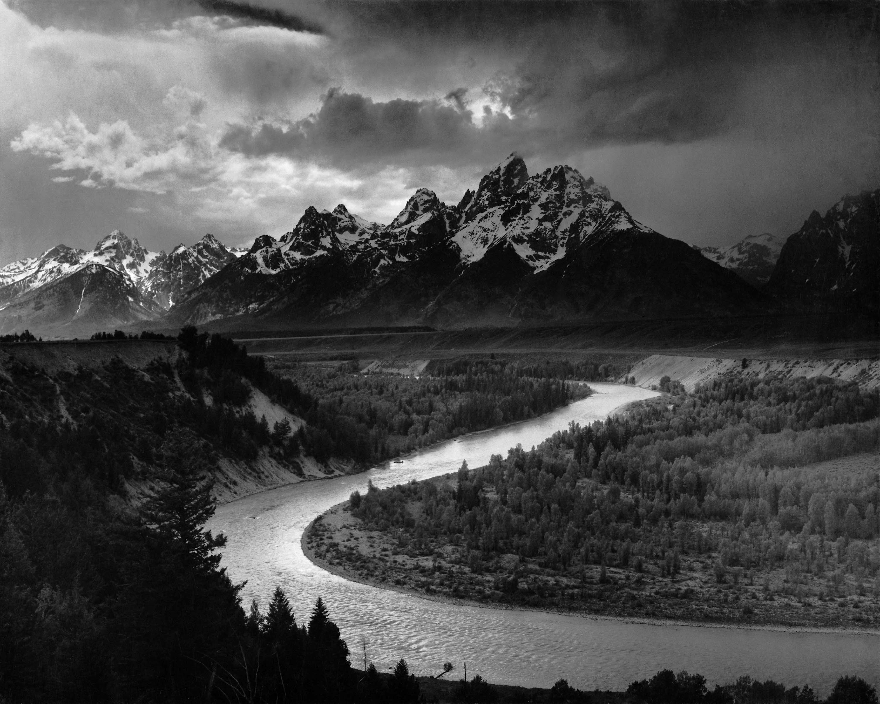
Book Review: Ansel Adams - 400 Photographs, Edited By Andrea G. Stillman

Written by T. Michael Testi


Ansel Adams: 400 Photographs is one of those monumental undertakings not only because of the man who created this body of work, but because of the volume of his body of work, and the number of people he influenced. To try to pare this down to 40 (Examples: The Making of 40 Photographs by Ansel Adams) or in this case 400 photographs takes time, effort, and dedication.

For those who may not know of Ansel Adams, or whom have only heard his name with relation to photography, he was the most honored American photographer of the twentieth century. Once destined to become a concert pianist he instead chose photography. Over the course of the next 50 plus years he defined the art of photography.

400 Photographs constitutes a study in that life. The book is 440 pages long and, as the title states, contains 400 of Adams' finest photographs. The book is arranged into five major periods which correspond to his growth as an artist. It is edited by Andrea Stillman, a close associate and editor of seven of Adams' books. 400 Photographs starts with an introduction in which Stillman gives a brief overview of Ansel Adams' life.

"1916-1930 – Yosemite and the High Sierra" begins when Adams was 14 years old and he visited Yosemite for the first time. He had his first camera, and on this trip he recorded a "visual diary" of where he had been. This chapter begins with some of the images he took and of the album he had made with his father. Some of these are very rare images including one of his first of "Half Dome." You can see the growth of his work between 1918 and 1927 as he developed from simple records of scenery to more artistic expressions. In 1927 he began the process that would later become "visualization." It was here that he began to photograph with much more authority and you can see the new power that his images gained.

"1931-1939 – Group f/64 and Alfred Stieglitz" shows the influence of a loose group of West Coast photographers that included Edward Weston and Imogen Cunningham called Group f/64. This group promoted "straight" photography as opposed to the "pictorialist" methods that were in vogue at the time. They were trying to define photography as an art form by simple and direct presentation as opposed to photography as relating to painting and graphic arts.

During this time the compositions of Adams' photographs began to change. He tried to present his subject in as straightforward manner as possible. He also lowered his horizon now including cloud filled skies. It was also during this time that Alfred Stieglitz, the director of America's foremost gallery of modern art, An American Place, exhibited Adams' photographs which took Adams' work to a larger audience.

Image by Ansel Adams for the National Parks Service 1942"1940-1949 – National Parks and Monuments" describes the time period in which Adams was commissioned by then U.S. Secretary of the Interior Harold Ickes to photograph the national parks and monuments for murals to be displayed in the Department of the Interior's new Washington D.C. headquarters. It was during this time period that his work grew in different geographic directions beyond California and the Southwest, branching out to other locations across the country.

"1950-1959 – Conservation, Publications, and Commissions" focused Adams' attentions on photographic commissions and writing. It was during this time that he wrote the many technical books that became standard course materials, even to this day. He also spent time working on conservation issues with the Sierra Club as well as mounting exhibitions for them.

It was in 1956 with the help of Nancy Newhall that the exhibition "This is the American Earth" was presented. It was later turned into a book with Newhall's poetic text, and characterized as a wake up call to the nation for environmental issues.

"1960-1968 – Carmel" examines the time in the life of Adams, that although he photographed less and less, he printed more and more. Adams never worked with a lab as did many of his contemporaries. He made every print himself. During this time, when he was not printing, he was writing, teaching, and tackling conservation issues.

"Notes on Selected Photographs" contains information on selected images from throughout the book. There are over 75 images that contain comments, history, and other interesting insights into the artist. 400 Photographs is fully indexed by title and by subject. There is also included a bibliography of both Adams' work as well as works on Adams.

When I was growing up, my doctor had an Adams mural on the walls in one of his patient rooms. The image to me was enormous. Even more, the impact on me of this image was enormous. It has shaped the way I viewed photography and in many ways, how I view life in general. When I view the photographs in 400 Photographs, I get this same feeling.

Sure, the small images that are presented in this book cannot replace the feeling that one gets when you see his full size presentations, but that is not the purpose of this book. 400 Photographs is about presenting a body of work from someone who chose not to make photography fit into the notion of the pictorial art of the day, but instead made photography into an art form that could stand on its own. That is what makes this book so important.

I think that Ansel Adams: 400 Photographs is an absolute must have for anyone that enjoys Ansel Adams, art work, photography, or just wants to get lost into the world of images. It is also a must have for artists from other disciplines as the compositions, arrangement of light, and locations are inspirational. It should also be in every waiting room or patient room as well; you never know whom it will inspire.

Wednesday, October 29, 2008

Book Review: Food Styling For Photographers by Linda Bellingham And Jean Ann Bybee

Written by T. Michael Testi

It is said that you eat with your eyes first. That can be derived by the fact that so many menus and restaurant advertisements have professional food stylists setting up photographic shoots to wow you with their images. But while these images really want to make you desire that dish, you would probably get ill if you tried to eat it as it was shot. In fact at the start of Food Styling For Photographers, there is a disclaimer that these methods of food preparation are not meant for human consumption.

In Food Styling For Photographers you will learn the tricks of what it takes to create that look that will have people wanting to taste the delectables. The premise of this book is that not all shoots can afford to hire a professional food stylist, or there is not the time to find one to make a deadline. As a professional photographer, there may be times in which you have to take the bull by the horns and do it yourself. Food Styling For Photographers is 272 pages and is divided into 12 chapters.

Chapter 1, "Introduction to Food Styling," begins by giving an overview of what food styling is, and to set up some rules and guidelines for the styling of food. You will see how to shop like a stylist, as well as assembling your own food styling kit. Chapter 2, "Sets and Setting," now gets in to the basics of what to consider when planning food photography; "What is the point of the shot?" In this chapter you will learn about how to properly set up the shot so as to make it pop in the image.

Chapter 3, "Chilling Facts About Cold Beverages," explains that you really have only a short window of opportunity to get the right shot when dealing with cold beverages, but with the right techniques, you can fake the effects which will let you better control the appearance and give you more latitude with that time window. Chapter 4, "Making a Salad for the Camera," begins by showing you the proper selection of ingredients so that you can build a feast for the eyes. Here you will see how to put together the proper ingredients to create a salad that has the all of the colors and textures to temp the viewer.

Chapter 5, "Pasta and Sauces," to a stylist is like a blank canvas to artist. There are a wide variety of colors and textures that can be added to the various shapes of pasta to make the viewer's mouth water. Chapter 6, "Burgers, Sandwiches and Beyond," explains that even though it may appear simple, working with burgers and hot dogs is extremely difficult to do correctly. In this chapter you will see how to locate the perfect bun, prep the patties and prepare everything just right.

Chapter 7, "Meeting Meat Head-On," begins with another warning about not eating this food, and that you should use some sort of vinyl or latex gloves when working with meat for safety reasons. Then it gets on to the various ways to cook the meat, building the layout, and even stylizing the meat when it contains bones. While the types of meats available are many, here you will work with beef, chicken and fish. Chapter 8, "Veggie Perfect," again begins with showing you how to shop for your produce, what to look for, and how to prepare it. You then will learn all of the tricks to get that fresh look just right.

Chapter 9, "Ice Cream for Hot Lights," starts off by saying that if you are selling ice cream, then you must photograph the real thing, if you are selling the topping or just using it as a prop, then you can fake the ice cream. Here the author gives a very brief talk about shooting the real thing, but this chapter focuses on creating fake ice cream. Chapter 10, "Desserts," discusses the building and shooting of whole cakes, cheese cakes, and cookies, and what it takes to get your just deserts.

Chapter 11, "Breakfast for the Camera," looks at making bacon for the camera, creating beautiful biscuits, and making eggs that pop out of the image. Chapter 12, "Garnishing Basics" finishes off by describing garnishing guidelines for making your food appeal to the viewer. Here you will see how to finish off the plate for professional look.

Food Styling For Photographers is very nicely laid out, is well written, and easy to understand. Each chapter has "Tricks of the Trade" where the authors explain little tidbits of knowledge that will help you along your path to learning how to style food. Included as well are "safety notes" to keep you safe since you are dealing with food, fire, knifes, as well as a host of other thing that can be potentially dangerous.

While I wish that there were more, and in more detail, I also like the fact that they have "Photographers Comments" on how to set up the shots that you see in Food Styling For Photographers . There are photographs of the shoot itself so that you can see the layout of the camera, lights and other things that create the photograph. You also get a list of all the supplies that were used to complete the shot.

Beyond the fact that I think that there is a need for books like Food Styling For Photographers, I think that it serves a purpose on showing what it takes to shoot for effect of sales and advertising. If you want to see what it takes to do food styling for photography then I very highly recommend this book.

Technorati Tags: ,

Tuesday, October 28, 2008

Book Review: The Adobe Photoshop Lightroom 2 Book by Martin Evening

Written by T. Michael Testi


Last August, Adobe released the second incarnation of their photography workflow product Adobe Photoshop Lightroom 2 to rave reviews. As is to be expected, Martin Evening has updated his bestselling book The Adobe Photoshop Lightroom Book to enhance his existing material as well as to reflect all of the changes to Lightroom 2.

The Adobe Photoshop Lightroom 2 Book: The Complete Guide for Photographers has been significantly updated and, as with the prior version, it was written with photographers in mind, addressing Lightroom's features from a professional photographer's perspective. This version is 624 pages in length (a whopping 272 additional pages of material) and contains 11 chapters (encompassed in 5 additional chapters).

Chapter 1, "Introducing Adobe Photoshop Lightroom," begins by describing exactly what Lightroom is, and where it fits in within your image processing workflow. Lightroom is a high quality image processer and photographic image database management system rolled into one. In this chapter you will learn about installing Lightroom as well as all about working with the Lightroom interface. Chapter 2, "Importing Photos," explains that because Lightroom is a catalog management system for your images, the first step is that you need to import images. Next you will learn about all of the options that are available to you such as converting images to Digital Negatives (DNG), using Adobe Bridge as a front end, and how imported images are organized.

Chapter 3, "Navigating the Library Module," now begins the journey into working with the various Lightroom modules beginning with the Library. This first look at the library module examines how you to use it to navigate the photos in your catalog. You will also see what tools you have available to refine your image selections. Chapter 4, "Managing Photos in the Library Module," shows you how to organize and catalog your images. Then you will see how it provides a flexible system of file management so that you can really work with your images through file naming, custom metadata, and adding keywords so that you can optimize your searching capabilities.

Chapter 5, "Working with Catalogs," examines how to work with the catalog system in Lightroom. The catalog plays a central role in Lightroom in that it keeps track of where all of your images are located as well as the information that is stored with your photos. Chapter 6, "Develop Module Image Editing," explains how to use one of the most powerful features of Lightroom, the develop module. It is this image processing module that records the changes that you want to make to an image. It stores these changes within the system, but it waits until you actually export an image before it applies the changes.

Chapter 7, "The Art of Black and White," now takes a look at how to transform your images into Black and White. Here you will learn the three main ways to convert an image as well as how not to convert your image to Black and White. You will also see specialized techniques such as creating a Black and White infrared look. Chapter 8, "Sharpening and Nose Reduction," takes on the topics of capture sharpening and noise reduction. This chapter emphasizes that importance of cleaning up an image early on, and what it takes to get that pre-sharpening done without introducing artifacts.

Chapter 9, "The Photoshop Connection," describes how you can take it to the next level when you need that extra processing that only Photoshop can provide. What you want to do is to look at Lightroom as that place where you work with, and process, many images at a time, and Photoshop where you process images one at a time. Chapter 10, "Printing," discusses how to work with the print module and how you can set up batches of images in a print queue to produce high quality prints, or work in fast mode to process quick result items like contact sheets. Best of all, to produce the best, most consistent results, you can set up custom templates to use over and over.

Chapter 11, "Presenting your Work," now shows how to present your non-printed work by using Lightroom's Web module. Here you will see how to create and upload a website of your pictures. You will also see how to create a slideshow that can be presented on computer, or exported as a self-contained presentation for business or personal use.

So what do I think of The Adobe Photoshop Lightroom 2 Book? Let me preface it by saying that I really liked the first version, but I think that this version is much better. Why? First and foremost is the fact that this one is much more complete and better thought-out. Second, is that it goes into more advanced information that is not found in similar books. You do not get the feeling that anything presented here was glossed over.

In addition, when the Lightroom first came out it was a version one product, and while the author had been using the product prior to release; back to the early Shadowland days of the product, he was probably like everyone else - still trying to figure it out from a technical, real world approach. Now, well over a year later of use, he has had the time to discern the best practices from an on the job standpoint, and in The Adobe Photoshop Lightroom 2 Book it really shows.

I think that if you don't have the first version, then, The Adobe Photoshop Lightroom 2 Book is well worth the investment. If you do have the first version and liked it, I think that this second version is worth getting as well as it really covers things in much more depth and detail. If you want to become an advanced Lightroom guru, therefore, I very highly recommend this book.